
<- Return to Portfolio Overview Page
Case Study Contents
- Background and Challenge
- High-Level Goals
- Typical product creation experience in TouchNote
- Early Insights from research and audits
- Exploration and Iteration
- Results: V1/Single-Frame
a. Product Creation Flow - Mobile
b. Product Showcase - Web - Results: V2/Multi-Frame
a. Product Creation Flow - Mobile
b. Product Creation Flow - Web - Feature: Preview My Frames
- Impact and Success
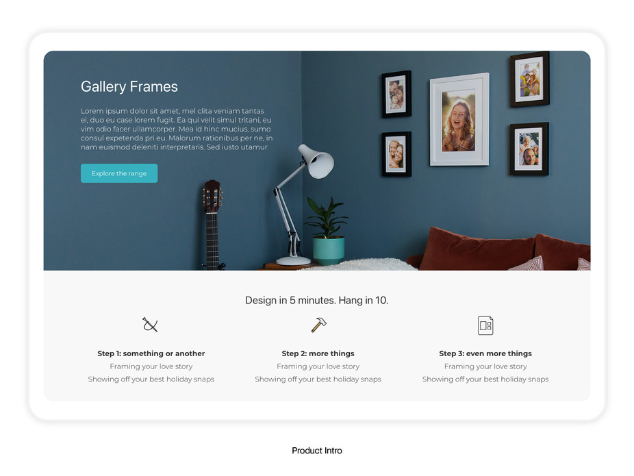
Background and Challenge
TouchNote, who were mainly selling products with small margins (like postcards, greetings cards, and small canvases), were now looking to move into selling larger-ticket, physical, photo-based products.
The Challenge: We needed a new product line that would help us do just that and help to establish a tone for the brand to transition into selling more, higher-priced goods.
For this challenge I worked to provide a UX/UI solution in collaboration with Product Manager and Head of Design.
High-Level Goals
-
Creating a large product should be as simple and as pain-free an experience as users had come to expect with, and were now familiar with, creating other physical photo-based product lines from their TouchNote touch-points (be it on mobile or web).
-
The product line should ideally have a lower-risk variant in order to test adoption and sales before committing to the entire transition.
Immersing Ourselves In The Typical Product Creation Experience
This is what a typical Product Creation Flow looked like across the various products that Trutify sold via their app and web experience.
- Homescreen category/product inspiration
- Product selection
- Photo/illustration selection using dialog picker
- Layout options - all whilst preview of final product is in main focus
- Apply optional stickers
- Adding message
- Further optional customisations (handwriting styles, map location, custom stamp)
- Previewing the product
- Choosing an address
- Sending the product
Early Insights from Research and Audits
Upon exploring the range of photo-based products that were being shown off in inspirational, beautifully-designed homes on sites like Pinterest and Instagram, it became clear that our photo frame product, which was only a 4 x 6 framed picture at this stage, had potential in expanding.
However, to not push the product too far into the realm of premium (the TouchNote brand was positioned much more for the average household), we continually placed emphasis on making the transition from familiar products to this new product line as smooth as possible.
I determined that making our product creation flow as similar to that which had been designed for creating other products in the app and web experience was of extreme importance. Even to the detail of having the in-app pickers look the same to give users optional customisation features like they are familiar with, even without necessarily having the exact same features like fun stickers for this more premium-looking product, seemed to me to be important in giving users a sense of control over this new experience (whilst not also making it overwhelming in its customisation).
The Product Manager had also devised a rough idea of pricing expectations from conducting surveys with existing customers.
Exploration and Iteration
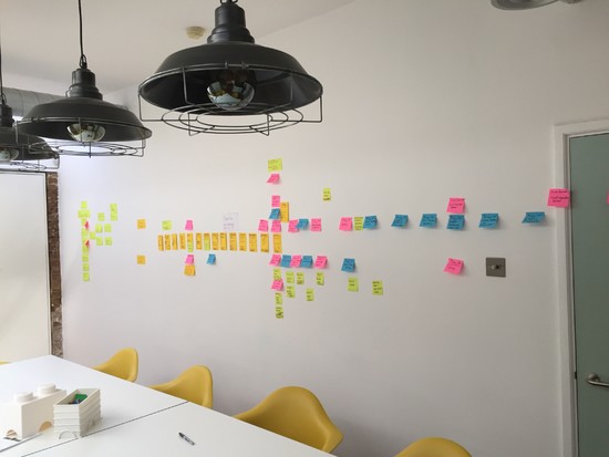
Product Manager, Head of Design, and I began to put together a collection of wooden frames in our office walls. We built an array of over 20 possible arrangements from testing different combinations (and even naming them, to see if they took life amongst our other colleagues in the team). This took us to scour through interior design photography, homes that were aspirational to our target customer audience. We even used tape on the wall at some points to speed up the process.
Taking photographs along the way, I took those ideas out into quick photoshop edits I could put into a dev build of our mobile app - giving us the chance to see the frames how users would see them.
After a few weeks of testing, and further surveying customers - we decided on Gallery Frames, a new product line of photo frames that would be sold in collections, at the time named after star constellations to hint at the connective nature of the bundled frames. They would arrive in people’s homes with a paper instruction manual that helped guide them through the setup process - the Head of Design at TouchNote was responsible for this.
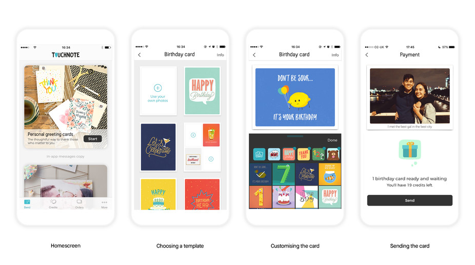
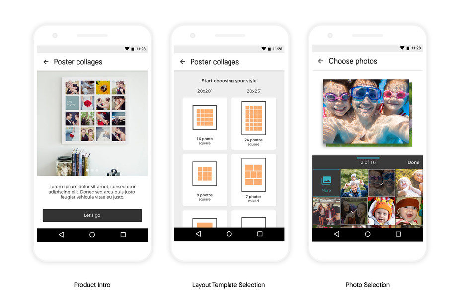
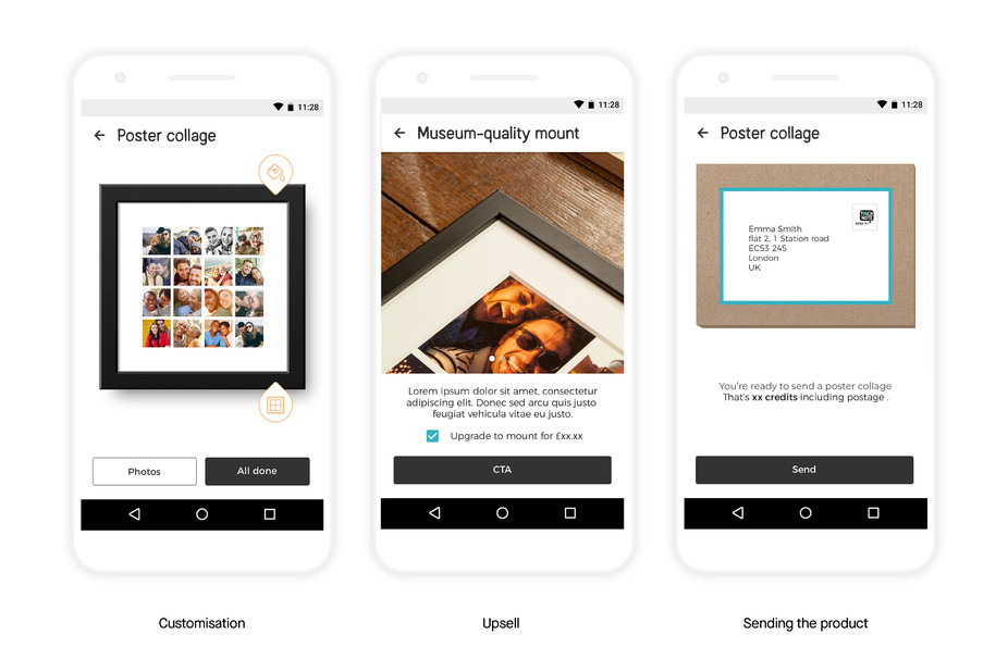
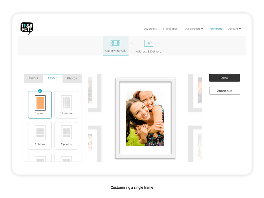
Results: V1 Single-Frame
In the meantime, to test the adoption of the larger products without having to commit to purchasing the larger array of different frame sizes, we first launched with simple 1 frame solution. We sold the 1 frame solution in 2 sizes.
I designed a mobile flow that took users through a very similar process to what they were familiar with in creating greetings cards, postcards, and canvases before (although even more streamlined to compensate for the expected complexity from consumers):
- Homescreen category/product inspiration
- Product introduction
- Poster size/Photo layout template selection
- Photo/illustration selection using picker dialog
- Further optional customisations (frame colour)
- Upselling a frame mount
- Choosing an address
- Sending the product
Product Creation Flow - Mobile
Product Showcase - Web
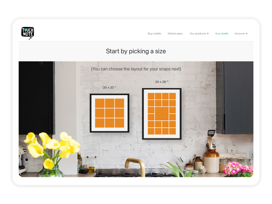
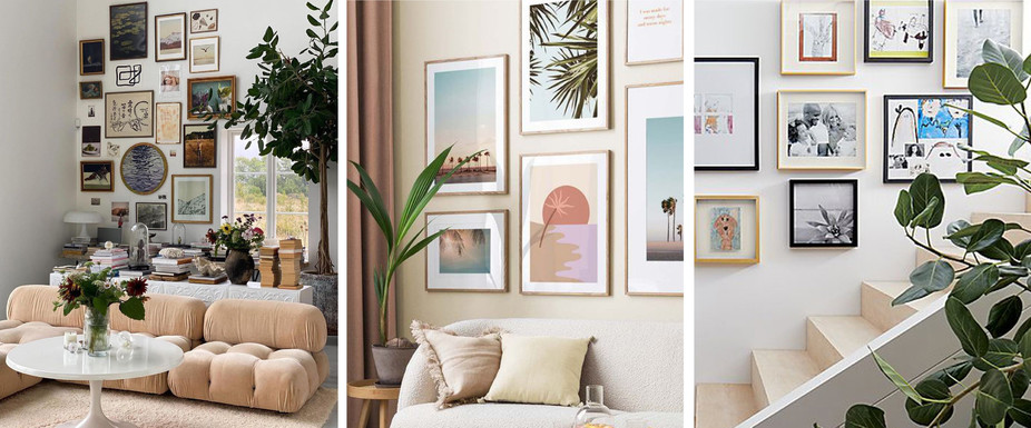
I also designed 2 variants to showcase the new frames for selection in web experience in order to A/B test them. One that showcased the products as large as possible, and another one that put them into better context of a real home.
The one that showcased the frames in context performed better.
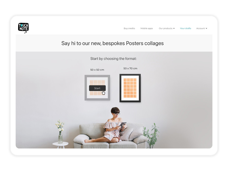
Results: V2/Multi-Frame
Product Creation Flow - Mobile
Transitioning from the V1 single-frame product, to the V2 multi-frame product required the flow design to carry similar characteristics.
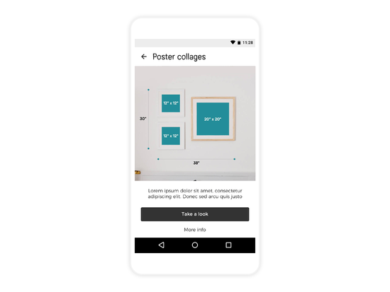
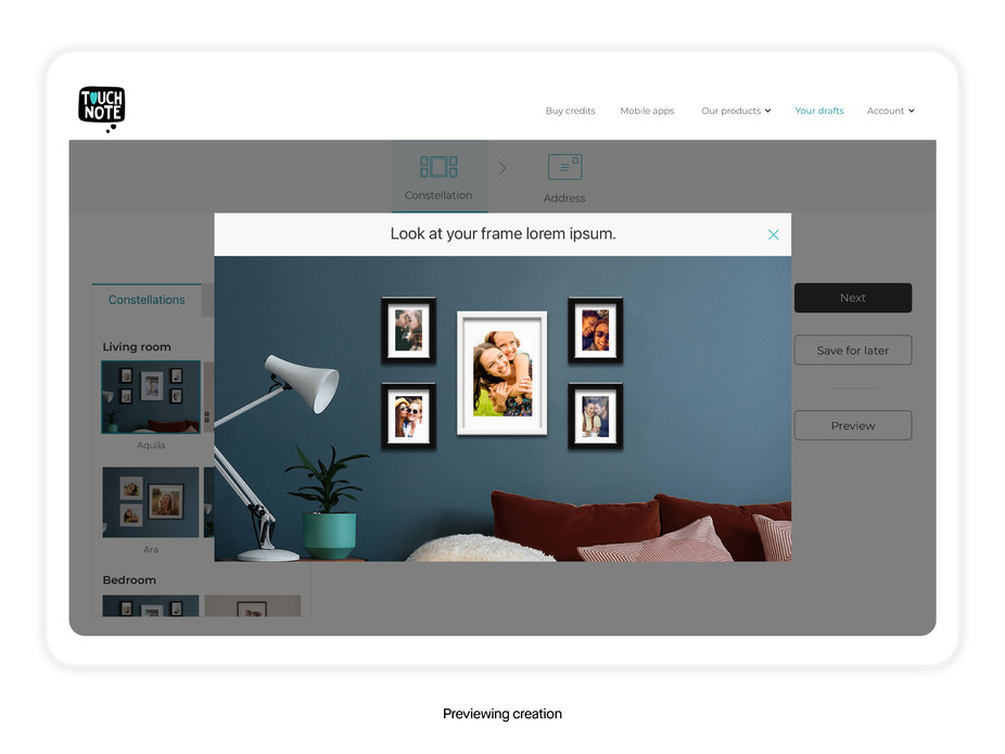
One prominent feature that did not exist before however, was in the showcasing of the frame arrangements. So I designed an intro screen that featured a prominent image carousel, as well as a screen that displayed the range of frame bundles that made use of the marketing material that the brand team had shot with the frames.
I sorted these frame collections by room, as to help the user visualise the frames being hung up in their own space, and to group the frames to reduce the risk of ignoring Hick’s Law (More options leads to harder decisions).
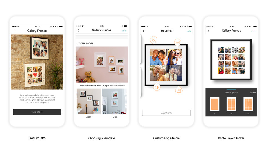
Additionally we added a ‘layer’ of navigation for the user to easily zoom in and out of the individual frame view (in order to customise that particular frame, and the collection preview to see how the photos look together.
Product Creation Flow - Web
Learning what we had done from the high-performing result of showcasing the frames in context of a real looking home, the web experience took the approach of displaying in as realistic a manner as possible in the product template selection process.
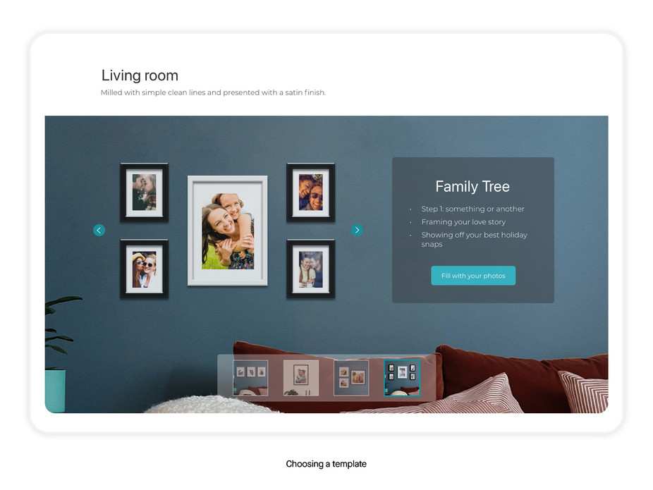
We added tooltips as hints along the way to help guide them, catering to and removing any additional perceived complexities for users.
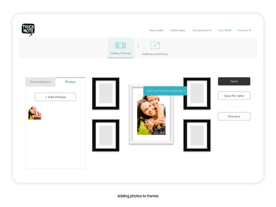
Zooming in and out of the frame collections was designed to be just as easy as designed for mobile. Just by clicking on a frame, the viewport would zoom in and prompt a menu panel change on the left - allowing the user to customise that frame by layout, photo, or frame colour.
I also designed a means for the users to get an image render, showing their frames (with their photos) on a wall - an easily dismissible dialog was used to allow the user to get right back to customising without hassle.
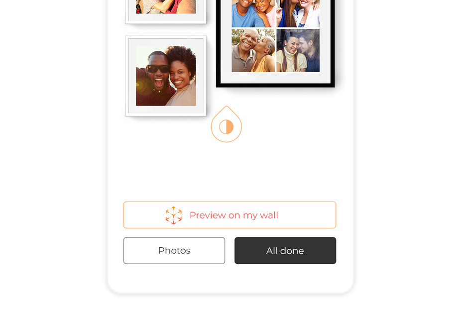
Feature: Preview My Frames On A Real Wall
Prompted by the fact that iOS had just made ARKit available to developers, we realised that by enabling users with an AR function, they could actually see their photos, in gallery frames, on their wall - leveraging the endowment effect (where users value something more if they feel it’s already theirs) in a powerful way.
Impact and Success
Following the successful test launch of singular gallery frames, the company gave our team the go-ahead to launch the larger, multi-frame product line - which they did very successfully under Konstantinos ‘Kosta’ Askitopoulos’ product management, following my leaving the company.
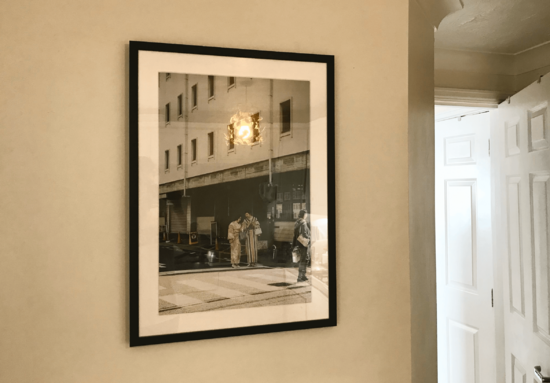
However, my parents were one of the first customers of the single-frame product soft launch and were very pleased with it when it arrived at their home. The quality of the end product is something they still often speak highly about, frequently showing it off to guests as they proudly display it amongst all of their art and photos in the home.
Above all, this result makes me happiest.
Special thanks to
Konstantinos Askitopoulos - Product Manager
Gaspare Frazzitta - Head of Design
James Kelly - Lead iOS Developer
***