
<- Return to Portfolio Overview Page
Case Study Contents
- Background and Challenge
- High-Level Goals
- Research: Current Experience Audit
- Key Insight I Derived
- Iteration and Exploration
- Final Solution: Redesign for New Users
- Result: 13.1% Conversion Increase
Background and Challenge
On my 3rd day at Bother, the Head of Product noted that whilst most customers were adding products to their Box (basket) from the Product Listing Pages (PLP); as recent performance-marketing ads were taking prospect customers directly to Product Details Pages (PDP), there was a desire to increase conversion from those pages.
I volunteered to jump in right away, knowing well that I learn best about a company and it’s goals when deep in a product challenge.
High-Level Goals
-
Improve conversion of new visitors / move customers toward making their first order.
-
Help people understand Bother Club offering without compromising conversion.
Research: Current Experience Design Audit
The Product Details Page (PDP) is navigated to when a user taps on a product card from a Product Listing Page (PLP), the Homepage, or from discovery via search.
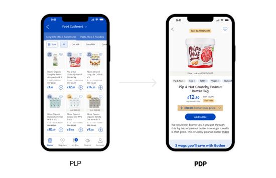
However the new performance-marketing ads were funnelling prospect customers from Meta platforms, directly to the Product Details Page (PDP).
Parallel to this, I discovered in customer interviews that a lot of users navigated directly to PDP from Google search results when looking for a particular grocery item and found Bother to be of good value.
I noted then that this page had a few jobs to do properly in order to convert customers in a meaningful way.
So, after a deep exploration, that included showing the PDP in its current state to a handful of users who have never used Bother and asking them to interact with it, here is what I discovered…
Below is a presentation I gave within the company that highlighted the problems in the current PDP.
(Click the screen and use the arrow keys to navigate through the presentation below. You can also click the expand arrows in the top right corner to view full screen.)
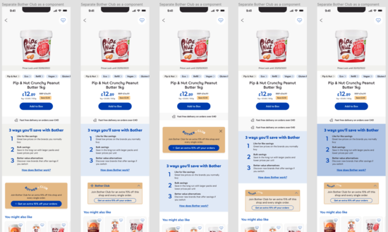
1. Bother Club placement
Being too close to the price lockup causes more users to tap on Bother Club price component than ‘Add to Box’ and churning on Bother Club flow.
2. Concepts like ‘Box’ are new
And so aren’t as familiar with new users, so the CTA isn’t as obvious as the visual language might suggest, especially when contrasted with an exciting price module.
3. Product-level price-to-price comparison
Likely leaving users who continue without Bother Club feeling that they are not getting the best value using Bother (for the first time) - missing out on EVERY product they add to their first box.
4. No introduction to what Bother as a company offers above the fold
Education opportunity for new users who land here first.
Key Insight I Derived
It was clear that the Bother Club, a subscription offer that got members 15% off their entire basket amount every shop, was in direct conflict with prospect users’ education of Bother as a service.
This was because the price of the product with the additional 15% off from the Bother Club was being pitched at the same time as the Bother price, which users coming from performance ads were already being told was a saving. This would naturally cause an overwhelming cognitive load and play into Hick's Law - both things that were very likely to be affecting conversion.
Not only this, but the Bother Club upsell and sign up flow, that customers would navigate through from tapping on the Bother Club price module, would move away from talking about the particular product that the customer was looking at, and into the education of the holistic offering the Bother Club provides. This naturally would be negating the principle of allowing users to getting their job done.
So the key solution was to move anything related to the Bother Club out of the viewport above the fold, and to make it speak to the holistic, 15% shop-wide discount offer as to prevent any confusion with the initial savings Bother was already offering against the RRP and advertising boldly in their marketing.
Whilst the Bother Club price was desirable from a marketing-principle perspective (showing the lowest possible price); having people discover the Bother Club price but churn before ordering their first box, where they are required to add £40+ worth of products* to complete, was ultimately undesirable as a trade-off.
*Bonus: see how I redesigned the framing around Bother's required minimum spend.
Iteration and Exploration
I requested that I could collaborate across 2 squads, with both Konstantinos Askitopoulos (the SPM who led the product squad focused on new user bets) and Lorin Minxhozi (the SPM who led the product squad focused on veteran user bets) to mitigate any risks across different user segments as I was newer to the business.
Together we quickly explored and iterated through 35+ variants. Examples of ideas explored include:
De-prioritising the Bother Club messaging in a separate module.
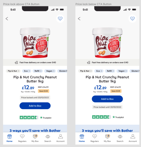
Playing with the arrangement of the Price Lock info and the Delivery Line.
Ultimately giving us something ready to build/ship in 1 sprint.
Below is a presentation I gave to the company in a demo that showcased the thinking behind each design decision in the new PDP.
(Click the screen and use the arrow keys to navigate through the presentation below. You can also click the expand arrows in the top right corner to view full screen.)
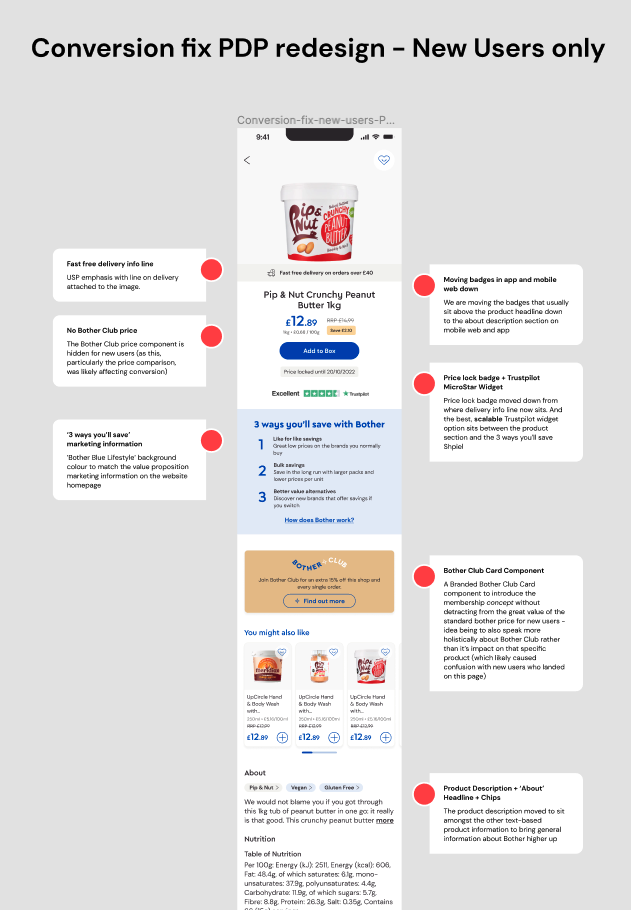
1. Emphasis on value that PMP report showed that our customers loved about Bother - DELIVERY!
Whilst also introducing the concept of Minimum Order Volume
2. One clear place/lockup for the price and savings badge
No immediate price-for-price comparison with Bother Club de-valuing the idea of Bother prices already being great value.
3. A responsive Trustpilot widget above the fold
And close to the Add to Box button to confirm trust where most needed.
4. Introduction to Bother’s value proposition above the fold.
Visually aligned with the website’s homepage marketing messaging.
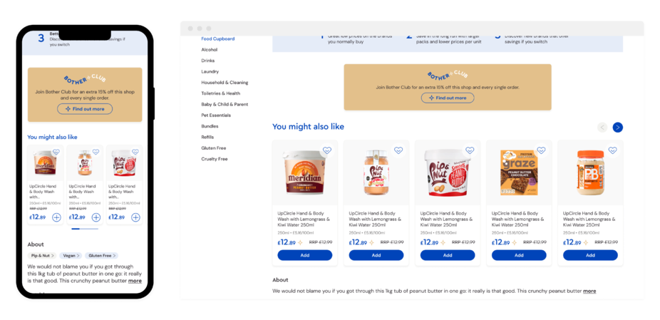
5. A more holistic, branded Bother Club component
One that both clearly educates the user on Bother Club as a concept separate to Bother, but also that this discount applies across a customer’s ENTIRE shop, not just select products.
6. De-prioritised description section now labelled ‘About’
With inclusion of category chips for better association of user’s task, and information.
Final Solution: PDP Redesign for New Users
Here are the final designs:
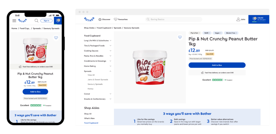
This version was then put into production, in an A/B test against the control version (previous PDP design).
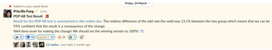
Result: 13.1% Increase on Conversion
The A/B test ran on new users (defined as users who had not logged in or users who were logged in, but never placed an order before) between 7th March - 23rd March. Between which there were 31,851 users in the control group and 31,729 in test group.
Here are the results from the data team:
- Statistically significant relative difference to the add rate - 13.1%
- The relative difference is greater than the MDE 10%
- We are 95% confidence that there’s difference between the two groups
- Bounce rate for the test group is also lower than the control group
- Conversion rate for the test group is slightly higher than the control group
- The difference between the membership conversion is minimal
The last result was particularly of note: as we took the risk of the number of people subscribing to Bother Club going down into account whilst designing - and ultimately we had minimal negative impact, despite no longer showing the lowest possible product price.
Special thanks to
Konstantinos Askitopoulos - Senior Product Manager
Lorin Minxhozi - Senior Product Manager
Belen Tahir - Senior Product Designer
Priscilla Fung - Senior Data Scientist
***
Definitions of Behavioural Insights used
Progressive Disclosure: Users are less overwhelmed if they’re exposed to complex features later.
Cognitive Load: The total amount of mental effort required to complete a task.
Hick’s Law: More options leads to harder decisions.
Contrast: Users’ attention is drawn to higher visual weights.
Default Bias: Users tend not to change an established behaviour and prefer experiences that are familiar to what they have already experienced.
***