
<- Return to Portfolio Overview Page
Ahead of first joining Bother, I used the Bother app, eager to explore and experience a new method of getting my household essentials delivered.
Soon after doing doing so, however, I ran into an issue that, in any normal scenario, might have caused me to churn…
This is how I was caught off guard during my first experience using the app, and the solution I designed to deal with this problem, as well as proposed how to increase a desire in users to fill their box quicker.
The Minimum Order Problem
After navigating through a smooth and pain-free onboarding process - I quickly got to adding items to my cart (known to me later as ‘My Box’).
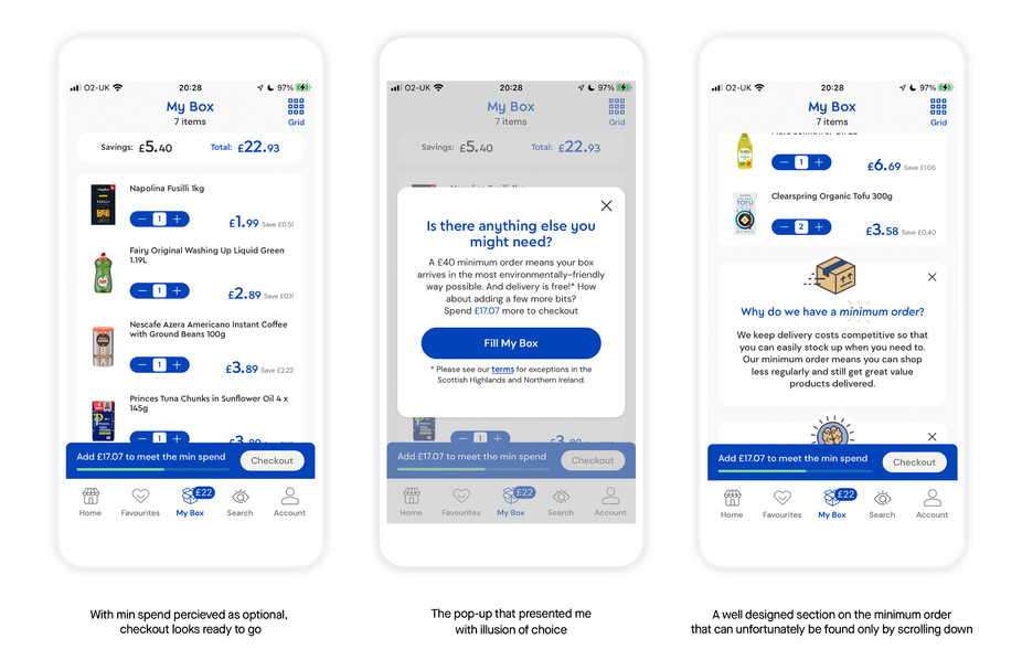
Once I decidedly got an order ready, I tapped the My Box tab that neatly informed me that I had £20 worth of items using a well-placed badge design.
I then scanned over the items I wanted in my first order and proceeded to checkout. I was notably excited.
And then suddenly… boom. The screen presented me with an overlaid pop-up dialog.
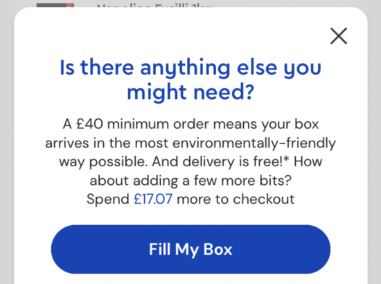
‘Is there anything else you might need?’ the dialog read. The immediate answer from me was no.
And yet, as my eyes moved past the paragraph of text, I noted that the only option was ‘Fill My Box’.
So, noting that I didn’t have a clear way out, I read over the central text for an explanation on how to proceed.
Instead, I’m informed that I cannot proceed as there is a minimum spend - not just to optionally get free delivery, but to actually fulfil my order at all. And, on top of that, I was notably only halfway to it with £17.07 remaining before I can checkout.
It’s at this stage, that I would likely churn.
Let me explain why this is likely the case…
In this moment my default bias was compromised. As a consumer, I’ve been conditioned to believe that I can simply have an order any number of items sent to me (e.g. Amazon, Instacart, Uber Eats).
And whilst the minimum order here is quite a big hurdle that seemingly works against the users expectations, it does not need to feel like a hurdle for the user.
After all, putting together and ordering my first box is exciting!
Think of people who order things they know they won’t need from Amazon, or order something again (even though they told themselves they needed to cut back and wouldn’t “buy anything else for at least a week”), just to feel the anticipation and endorphin rush of that parcel arriving.
Here is where an opportunity lies: the copy in the pop-up dialog currently causes frustration by reminding the user of the app’s perceived limitations, when it could address why the minimum spend exists in a positive frame (something the app does well later in the user’s journey).
It’s a shame, because the tone used here in ‘Is there anything else you might need?’ is quite natural, almost like how a friendly cashier would speak to you at a physical checkout. But the issue here is that at the time that question is posed, anything I could have possibly needed, I had already added to my box.
So by asking me to check again, I was left in a state of paralysis, brought further forward by the fact that the dialog presents me with the button: ‘Fill My Box’, cornering me to commit to a choice that doesn’t have an alternative.
Having to learn of this information and subsequently comply, as the only button available implies a user will, (particularly at the point where they are most interested in moving forward), the user might feel they are now moving backward, and potentially churn.
So I’d like to propose a solution that I’ve designed (utilising beautifully-presented information available later in the user journey, and sitting on the back of great design ideas already sprinkled throughout the app).
My key insight here being that: to alleviate the unfortunately timed shock felt, the user should have a view of why minimum spend exist before they even arrive at wanting to checkout…
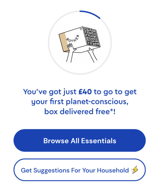
My Solution, Part 1 - What To Show The User Before They Start Filling Their Order.
It was clear that the solution was not in the dialog itself, but from returning to the beginning of the user’s experience with their Box - and framing the minimum order not as a limit to the user capabilities using Bother, rather as benefit (which the app admittedly does well later in the user’s journey, but the new structure would bring the benefits further forward to the forefront of the user’s mind).
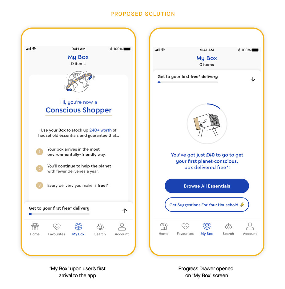
This is how the My Box screen would look at the point the user first enters the app.
It does a few things right away:
- It immediately addresses the minimum order, removing any possible uncertainties around it.
- It breaks down the benefits to the user enabled by this minimum order.
- It uses Identity Priming at the top of the screen to anchor the user.
But what is Identity Priming? It refers to the attempt to influence a person’s behaviour by emphasising them being part of a certain group or being a certain type of person before a particular experience.
These attempts often leverage social norms and stereotypes, as well as people’s general need to behave in a manner that’s congruent with how they see themselves (their identity).
People likely behave this way as a means to avoiding the cognitive dissonance that would be incurred from behaving differently from how someone believes themselves to be.
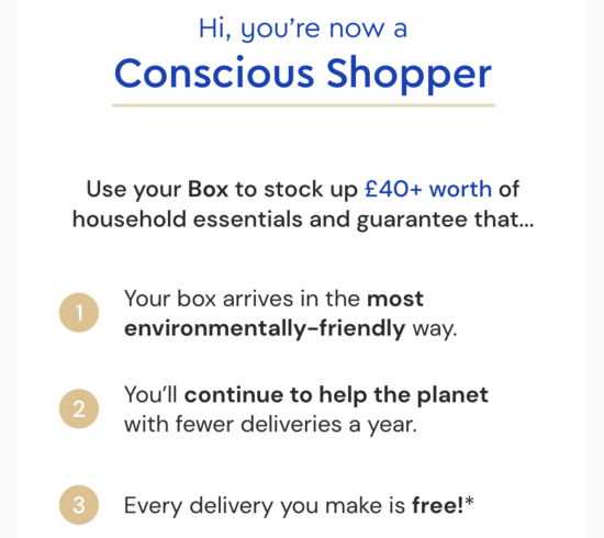
In this instance, by downloading Bother, the user is now a Conscious Shopper - and thus would subtly promote behaviour in the Bother app that reinforces this identity.
To truly ensure maximum potency, I would even suggest that the user actually lands in this screen immediately after onboarding - anchoring all subsequent purchasing decisions to this idea of conscious shopping.
Another problem I realised came with the original pop-up design, was that I didn’t know what else to fill my box with. I had everything I thought/knew I needed. This is the perfect time to provide the user with suggestions - better still if they seemingly came from the Bother BrainTM.
So I added an additional button that encouraged users to provide their household details via the Bother BrainTM, whilst directly having their problem solved - so they can feel the immediate impact of them having provided that data.
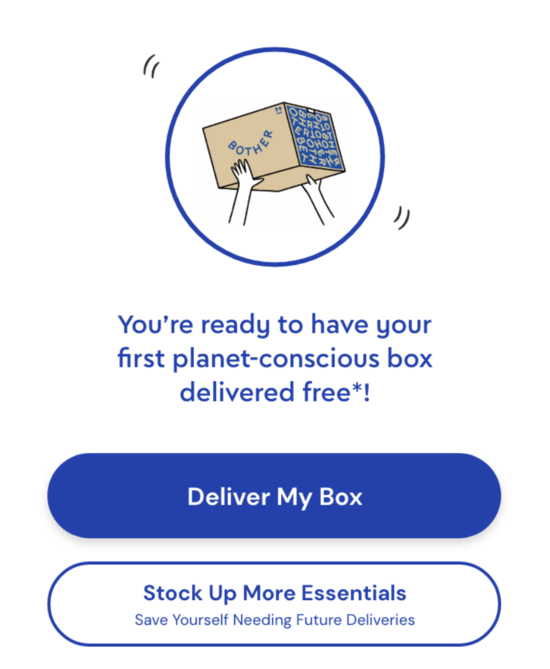
This was located in a drawer which attempts to make filling a box a fun target - rather than a limit on their usage of the service. I attempted to achieve this with two loading bars - one in the drawer preview (borrowed from the original design), and one that sat around an illustration of the box in a pair of hands (which would also fill with colour from left to right).
This idea leverages the Endowment Effect, as well as the Reward Anticipation a user would feel by visualising themselves getting their first Bother box!
My Solution, Part 2 - What To Show The User Once They Start Filling Their Order.
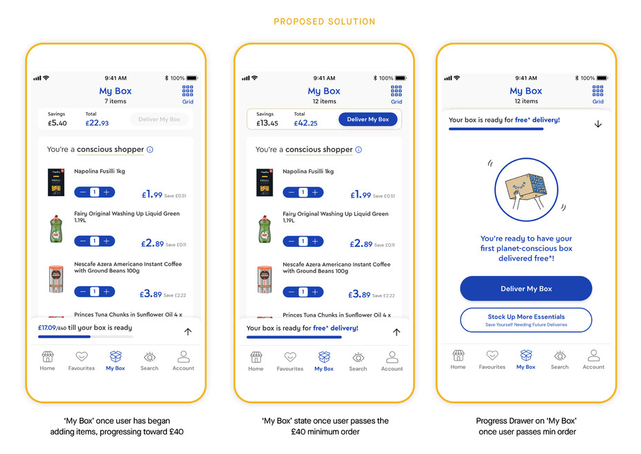
The above shows how the My Box screen evolves as the user moves toward filling their first box. The Primed Identity still remains at the top of the screen, even with items now populating the majority of the screen.
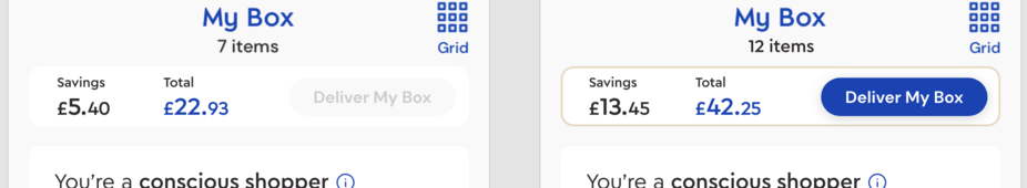
Conscious that placing a checkout button at the top of the screen can reduce its sense of finality in the visual hierarchy of the screen, I utilised contrast as much as possible (in both the colour of the button itself, and the card outline) to highlight it when the user surpasses the minimum order amount.
In the opened drawer, the buttons now present the user with the ability to Deliver My Box (sat against the complete box loading animation and progress bar to give the user great satisfaction), but also provide a conscious-context-aligned benefit in the option to add even more to their order - promoting an increase in spend-per-box, whilst adhering to the identity that the user was primed with.
I think this solution could go a long way to empower users with information that helps them to move past any perceived limitations and experience the benefits that Bother now provides their life.
The user’s excitement might now build uninterrupted as they fulfil their first order - all whilst gaining the deeper sense of trust that comes with a clear understanding of the product’s values.
***
Definitions of Behavioural Insights used
Default Bias: Users tend not to change an established behaviour.
Anchoring Bias: Users rely heavily on the first piece of information they see.
Reward anticipation: Processes associated with the ability to anticipate a future incentive cues about a future positive reinforcer.
Contrast: Users’ attention is drawn to higher visual weights.
(Social) Identity Priming: Users tend to behave in order to act congruently to the individual or group identity that they have been labelled as.
Framing: The way information is presented affects how users make decisions.
Labour Perception Bias: People trust and value things more when they see the underlying work.
Endowment Effect: Users value something more if they feel it’s theirs.
***