<- Return to Portfolio Overview Page
Case Study Contents
- Background and Challenge
- Research/Current Experience Audit
a. User Interviews
b. Insights From Users - High-Level Goals
- Design Approach
- Solution #1: What Can I Do, and What Will I Achieve
- Solution #2: What To Expect, and What Do I Need
- Solution #3: Clarifying the COVID-19 form
- Impact/Results
Background and Challenge
As patients were suddenly got shocked by the restrictions of pandemic, unable to now visit their dentist; having a method for which patients requiring assistance, or in pain could be attended to, was of great importance.
Startup, Bridge, understood this problem and set out to create a tele-dental consultation solution that would address and elevate patients concerns and issues as smoothly as possible in an unfamiliar world brought about by the COVID-19 pandemic.
Bridge had built an MVP (Minimal Viable Product) using meeting booking software, Calendly, that would provide dental practice patients the means to easily request a video consultation call with their usual dentist at a time that worked best with them.
The challenge: The founders of Bridge approached me to consult on their MVP to make any improvements I could to make this new transition for patients as smooth and as pain-free as possible; and thus make the first meaningful iteration (that also did little to expend their limited resources).
Research/Current Experience Design Audit
The current service experience did not have many glaring, sequential issues.
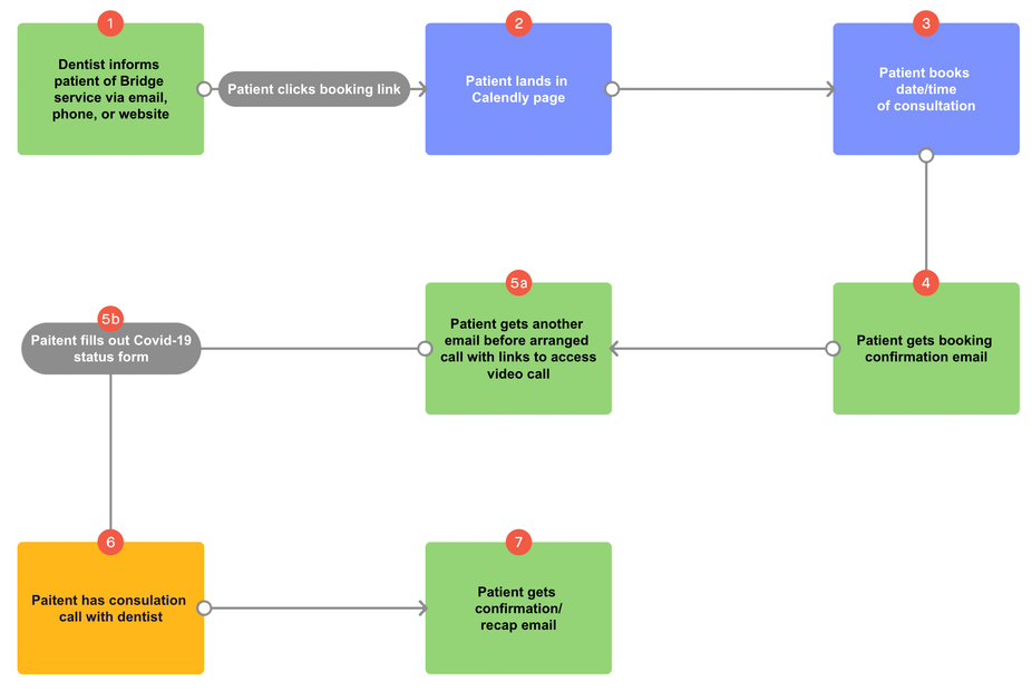
Breakdown:
-
The dental practice informs patients of Bridge (either via email, or with a link on their website)
-
The patient clicks link and lands in Calendly page
-
The patient selects a date/time for their consultation
-
The patient receives a confirmation email informing them of their now booked date and time
-
The patient receives an email 24 hours before their arranged call with a link to their video call (as well as a form to fill out about their COVID-19 status)
-
The patient has their consultation call with their dentist.
-
The patient receives an email to recap anything mentioned by their dentist, as well as any next steps that the patient should take (e.g. any prescriptions they have to now collect).
Right away, however, I noted that the COVID-19 status form that patients had to fill out being included with the video call link (5) strained on the cognitive load with two actions at once, as well as created unease around the short window of time the patient was provided with to fill out the form also.
Easy-win: I proposed that for as long as it was within 3 days of the consultation taking place (as to ensure the information was as relevant as possible), the COVID-19 status form was to be sent with the booking confirmation email (4) - giving patients time to fill out the form, and the perceived value that comes from a more appropriate use of progressive disclosure.
I then requested that a request for an optional “5 minute chat” (user interview) with myself could be included in the recap email sent by the dentist as to allow patients to provide feedback about their experience…
User Interviews
Of the patients that Bridge’s early dental partner had sent the initial email to, I spoke with 13 patients of them to conduct follow-up user interviews.
In doing so, quite a few concerns emerged that were inline with the exact concerns that the founders of Bridge had around how confusion and panic could be caused by the transition from the patient’s usual consultation to now using the foreign service: Bridge.
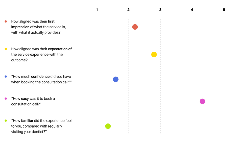
I discovered that quite a number of them shared similar pain points:
-
“I was surprised that I actually got advice during the call […] I thought I was just reporting my issue.”
-
“To be honest, I wasn’t entirely sure what will I actually get from this call? I thought that the call was to…”
-
“I didn’t understand what this was for […] I only got referred to this again once I had called the dentist a few times.”
-
“I wasn’t sure if I was meant to prepare or needed anything.”
-
“I thought this was my dentist referring me to some other company, I didn’t realise I’d be talking with Dr. Master” (their usual dentist)
Insights I Derived
Intent
We needed to reiterate the patient’s intent: why are they making a call? It was evident that patients needed clarity on when exactly to use this service. We had one patient book a call without even an issue to discuss.
Who Will I Be Speaking To
Patients were unclear if they’d be speaking with their usual dentist. ‘Bridge’ was being mistaken to be a third-party company that patients would have to speak to. Reassurance and clarity around this would put patients at ease.
What I’ll Need
There was remaining anxiety from not knowing what to prepare. The nature of this experience not simply being a ‘pop-in’, paired with the COVID-19 status form caused patients to assume they needed to be more prepared than they usually were when visiting the dentist. This is an anxiety that should always be addressed, even if the answer is ‘no, nothing.’
What I’ll Get / What To Expect
Patients had varying assumption as to what exactly the call was going to do for them. Providing clarity on expected outcomes would further give patients a sense of trust and feeling of ease.
High-Level Goals
-
User/Patient goal: For the introduction to a tele-dental consultation be clear on what it is, when/why they should use the service, what they will need, and what they can expect.
-
Dental Practice/Business goal: For the transition to tele-dental to be as pain-free for patients as possible, and to provide reassurance that patients can be attended to by their dentist, no matter the concern - even during such a time as the pandemic. Also to minimise any additional expenditure to running of the MVP/service.
Luckily, the goals for both the user/patient and the business were similarly aligned - providing the floor for the most user-friendly solution.
Design Approach
I realised my solution needed to focus mainly on the first point of contact patients would have with the service itself, the point which has the most potential to address the insights gleaned from speaking with patients - the Calendly booking page.
Here, a patient, whether existing or new, should be able to grasp exactly what to expect from booking a consultation through Bridge and what it will provide. It seemed that this was primarily going to require a UX writing solution.
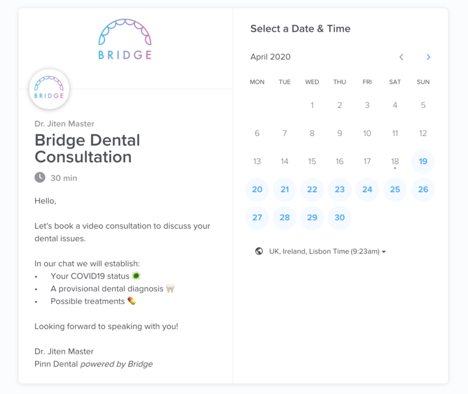
The context provided by this screen was lacking doubt elimination (a process of calling out and addressing concerns a user may have before they arrive to them). Using copy that did exactly this would remove any underlying anxieties and create confidence in the user to trust Bridge and the video consultation process.
I was also keen to highlight to patients that they would be speaking directly with their usual dentist, to further reassure them, and to leverage authority bias by giving the service an association with the authority that the patients are familiar with getting value of expertise from.
Below is what I designed to creating clarity on: intent, what you’ll need, expected outcomes, and the authority that patients were familiar with.
Solution #1: What Can I Do, Who Will I Speak With, and What Will I Achieve
The first half of the body text here was rewritten to address what a user could do now do because of Bridge, who they would be speaking with, and what they will achieve.
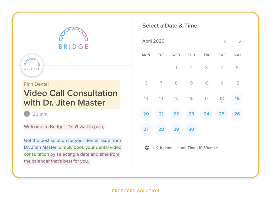
Yellow - Immediately addressing the fact that this is a Video Call Consultation with their regular dentist was important. The heading now spoke to that, rather than starting with ‘Bridge’ which is an unfamiliar brand, and thus, concept to patients.
Red - Priming the patient for an end-to-end experience with: ’Welcome’ suggesting the beginning of a process. Pair this with front-loaded value-add provided by Bridge.
Blue - Clearly stating what the patient will achieve as an outcome of the consultation in the first line (and eliminate doubt by associating it with an authority that patients were familiar with, and trusted).
Green - Addressing the simple action the user has to take and clearly state in what form the consultation will occur.
Pink - Following this by directing the user to the calendar and create a sense of ease to the whole process by reaffirming that the time of booking is their only decision to be made at this stage.
Solution #2: What To Expect, and What Do I Need
The second half of the body text needed to address what a patient was to expect by using Bridge, and what they would need to prepare, as well as leaving them with a clear next action bolstered with reassurance now that all of their FUDs (fears, uncertainties, and doubts) have been removed.
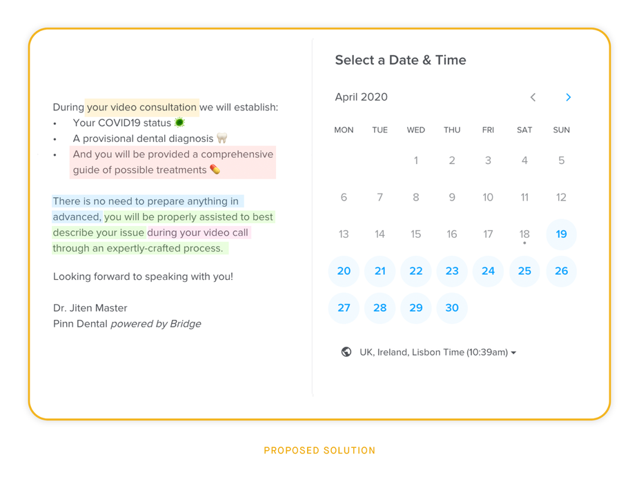
Yellow - A reminder of what the patient is actually booking before listing what to expect.
Red - Worth stating that it’s not only that the best treatment will be established, but also that the treatments will be provided via email after the call (this may be common practice in health sector, but the anticipation is part of what makes something rewarding and delightful).
Blue - Calling out and addressing the concern around whether the patient requires anything.
Green - This is then paired with confidence that there is a comprehensive process in place. Knowing that there is a system in place to the relaying of informing the dentist before diagnosis can create great confidence.
Pink - Reaffirming that the user can simply book and trust that the call itself will solve their concerns.
Solution #3: Clarifying the COVID-19 form
As highlighted (in blue) in the screenshot below, in the current COVID-19 status form that patients were required to fill out before their consultation - the option for stating that you do not have any covid-19 symptoms was not made clear as the antithetical option from those listed above it.
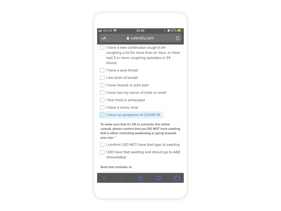
Due to the option sitting amongst those that were labelled by the heading ‘Tick any of these symptoms below if you have them’, a user could easily find themselves (as I also did) being unsure about ticking this box despite it being the box to tick when none of the symptoms listed applied to the patient, and thus most probably action.
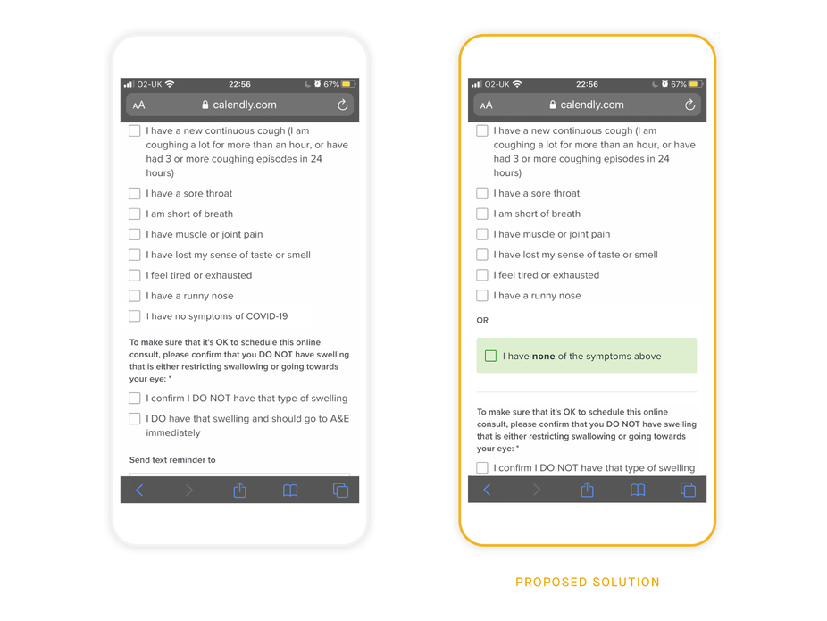
Re-writing the copy then as ‘I have none of the symptoms above’, utilising contrast, as well as visually separating it from the rest of the options above it addressed this in a manner that is clear to the user.
Especially in the early stages of the pandemic, patients were likely be using the listed symptoms to make the judgement about whether they had COVID-19 themselves, rather than knowing separately to seeing the symptoms. The suggested text and visual change would allows them to make that selection with confidence.
Impact / Result
The founders of Bridge were extremely excited to implement all of my proposed solutions, so I helped them do just that - working closely with a front-end developer in the process (who took my uploaded form design from handover tool, Zeplin).
After implementing the proposed solutions, and following another round of testing (now with patients from a new dental practice); it was noted that in the subsequent user interviews, the few concerns that were expressed were no longer to do with clarity around the setup and delivery of the Bridge service itself (e.g. there were questions around opening times of their local pharmacy for the collection of their prescription).
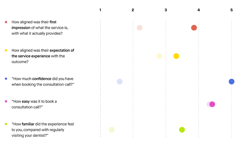
Proving that the concerns previously expressed had been addressed, and with further questions of mine relating to confidence and expectations of the service helping the patient have their issue addressed - the patients rated the experience very highly on this factor.
***
Definitions of Behavioural Insights used
Authority Bias: Users attribute more importance to the opinion of an authority figure.
Progressive Disclosure: Users are less overwhelmed if they’re exposed to complex features later.
Doubt elimination: A process of calling out and/or addressing concerns a user may have before they arrive to them independently.
Cognitive Load: The total amount of mental effort required to complete a task.
Reward anticipation: Processes associated with the ability to anticipate a future incentive cues about a future positive reinforcer.
Hick’s Law: More options leads to harder decisions.
Contrast: Users’ attention is drawn to higher visual weights.
Default Bias: Users tend not to change an established behaviour and prefer experiences that are familiar to what they have already experienced.
***
