
<- Return to Portfolio Overview Page
Inspired by my own father who, during his time in lockdown during a military coup in Ghana(!), created a habit to sit down and work on his book everyday - during our recent pandemic lockdown, I decided to tackle a new design problem every day.
Limiting myself to simply that day in order to complete each design, I developed a daily practice that had me waking up at 5am each morning before going into work - honing my skills as I attempted to create a solution to a variety of problems that excited me.
I did this for over 30+ days in a row and below are some highlights from this challenge:
- Personalised Sign-up Process
- Landing Page for Invite-Only Beta
- User Profile
- E-Commerce Bundle Builder
- Share/Referral Dialog
A Personalised Sign-up Process (Blue Bottle Coffee)
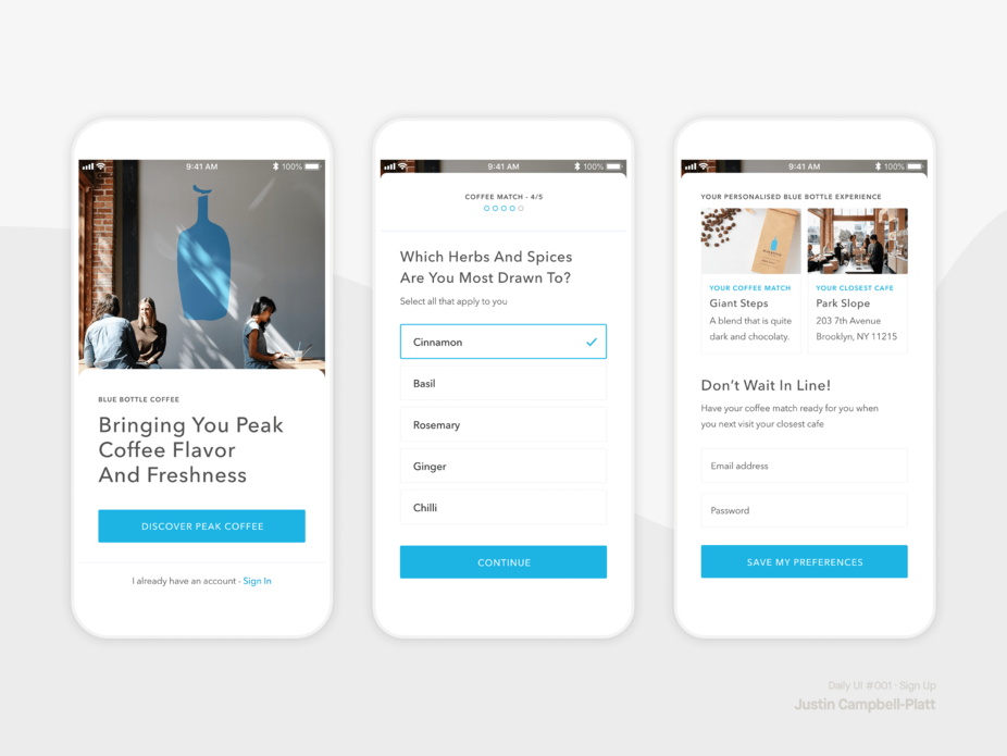
Key idea: Took the “Coffee Match” idea that Blue Bottle Coffee’s site uses for helping customers build and discover their optimum coffee subscription, and brought it to the Blue Bottle Coffee’s app onboarding process.
Leading with simple and pleasurable actions of tapping answers to fairly easy questions about their preference, this idea leveraged the insight of investment cost, and personalisation to have users more engaged through what is normally a fairly standard first interaction with any app.
The onboarding allowed users to aspire and visualise themselves drinking their best coffee.
Then, at the point of commitment (via email entry for account creation), I leveraged loss aversion by telling the users not to lose the custom match that had been created from their invested time and effort - thus likely increasing conversions, and also creating data Blue Bottle Coffee could use for a strong personalised home screen experience and email marketing to increase further engagement.
Behavioural insights used: Sunk-cost Fallacy, Endowment Effect, Loss Aversion.
Landing Page for Invite-Only Beta (YourStack)
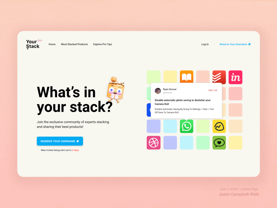
YourStack is a social network, founded by Ryan Hoover (founder of Product Hunt), that I was tremendously excited by upon its announcement. The idea was that it would allow people to showcase, rate, and rank the products and tools they used in their ‘stack’ and share Pro Tips that came about only from using them so often.
So I designed a landing page for the site whilst it remained in Beta, and so the goal was to highlight some of those features, whilst also ensuring the hype and allure from users not fully knowing how it would look
The image on the right was designed to preview tooltips from the app icons (the products) to show off the kind of useful content users would be sharing.
For the copy for the sign up button, I used “Reserve my username” to leverage the Endowment Effect by making the user feel they already deserve to have one on the new social network. Then, when paired with the fact that you want to get the same username you have already on Twitter, or fear missing out on the opportunity to identify as a first mover, I leveraged loss aversion, further emphasised with the sense of urgency prompted by the nudge created in the form of a countdown under the button.
Behavioural insights used: Endowment Effect, Loss Aversion, Scarcity.
User Profile (YourStack)
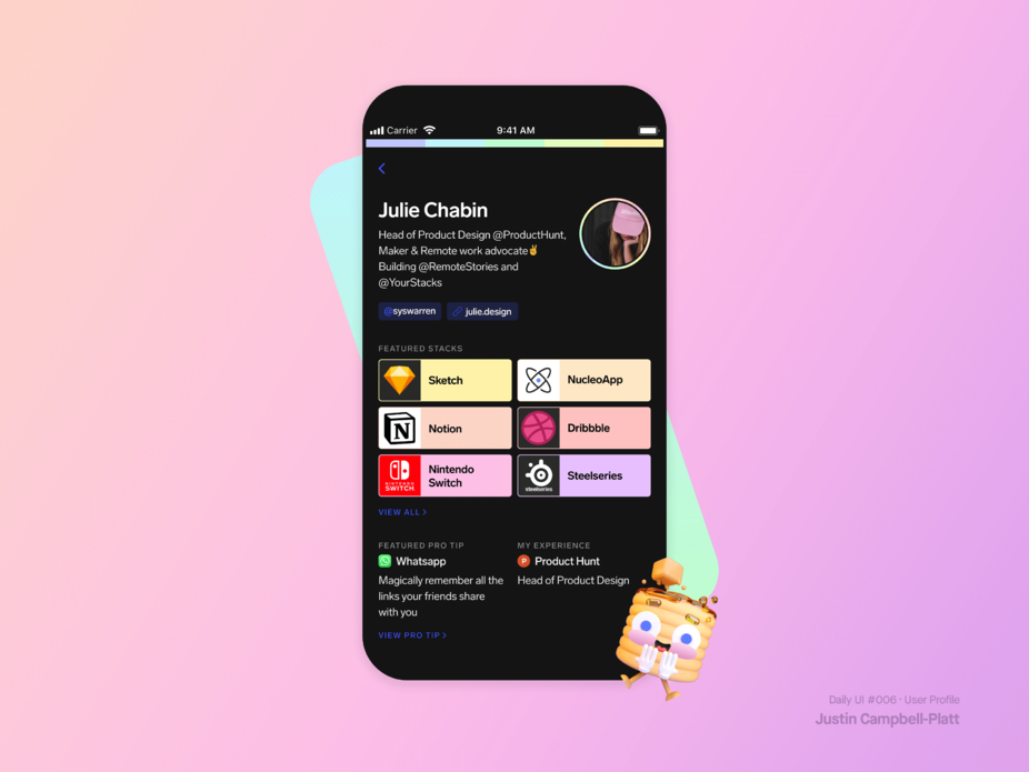
As I was aware that the concept of YourStack was fairly new, it was important that the Profile observed the default bias as to allow the features that separate it from other social media platforms to be highlighted to the user, rather than overwhelming cognitive load.
So for the top half of the User Profile, I designed a bio section that looked similar to that which users were familiar to customising and presenting on Twitter - giving them a smoother transition to adopt YourStack and then populate the site with content that showcased their favourite products, and helpful hints for other users.
Behavioural insights used: Default Bias, Cognitive Load.
E-Commerce Product Bundle Builder (Grovemade)
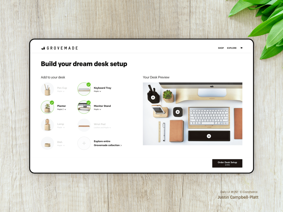
Prompted by the Covid-19 pandemic, there was a growing trend for knowledge worker’s to build work office stations in their homes to make the most of their new work from home situation in lockdown.
Noticing the increase in YouTube videos around this time that advised people who wanted to have a more complete work station setup, I designed a means for a company like Grovemade (an E-Commerce site that creates beautiful furniture and accessories) to harness this desire by allowing users to bundle a selection of complimentary products that Grovemade offered.
Key insight: Bundling is not only powerful for E-Commerce sites to increase spending per customer, but also to frame all the customers purchases as part of the larger solution to one problem.
On the right sits a desk preview that populates live with the user selection - helping them to envision the beautiful setup they will soon have.
Although Grovemade had a wider collection of similar products, I reduced the selection down to the essentials recommended so that the user can choose to swap out later or include more only by actively choosing to do so; thus observing Hick's Law by keeping the option pool limited and making decision making simpler.
Behavioural insights used: Endowment Effect, Hick’s Law.
Share/Referral Dialog (Gentle)
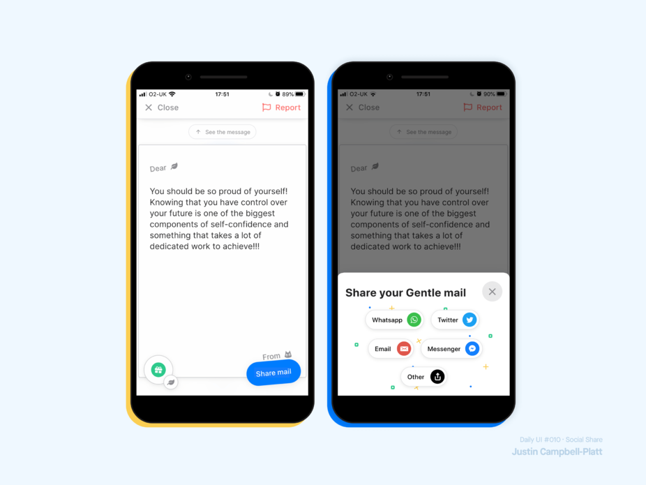
Gentle is a social app that centres on compassion, giving user the ability to anonymously send and receive messages of advice and kindness.
But the application had no referral mechanic that worked well so I noted that the strongest moment of high-emotion to be leveraged for sharing was the moment the user actually received and opened a message.
By allowing users to forward that message onto another friend that perhaps needed it, not only made way for a great prompt for sharing, but also remained consistent with the brand/theme of the app and framed the application to new users with a strong, warm emotional feeling of connection.
Behavioural Insights used: Framing, Reciprocity, Social Proof.
Definitions of Behavioural Insights used
Sunk-Cost Fallacy (Investment Cost): When a user is reluctant to abandon a strategy or course of action because they have invested in it.
Endowment Effect: Users value something more if they feel it’s theirs.
Loss Aversion: People prefer to avoid losses more than earning equivalent gains.
Default Bias: Users tend not to change an established behaviour and prefer experiences that are familiar to what they have already experienced.
Cognitive Load: Total amount of mental effort that is required to complete a task
Hick’s Law: More options leads to harder decisions
Reciprocity: People feel the need to reciprocate when they receive something
Social Proof: Users adapt their behaviours based on what others do
Framing: The way information is presented affects how users make decisions
***