
<- Return to Portfolio Overview Page
Case Study Contents
- Background and Challenge
- High-Level Goal
- Insights From Users
- High-Level Solution
- Fictional Happy Customer Quote
- Research: Competitor Analysis
- Research: Current Experience Audit
- Exploration and Iteration
- Usability Preference Test
- Final Solution
Background and Challenge
At the grocery e-commerce company, Bother, we (the product team) setup Hotjar survey following checkout to ask what worried customers and may have stopped them from making their first order.
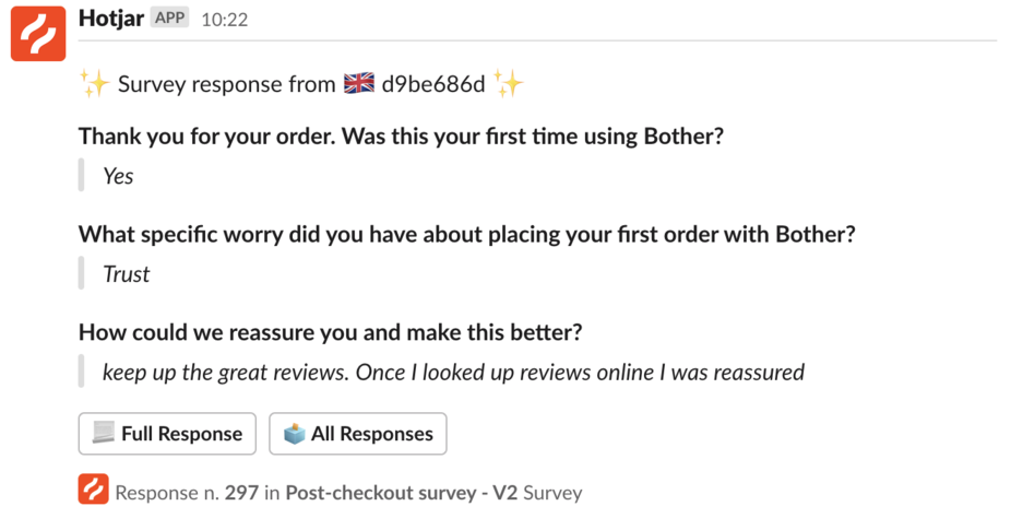
From doing so we observed that ‘Trust’ kept coming up as one of the key reasons that made users nervous when first using Bother.
These trust problems likely stemmed from Bother’s relatively recent entry into the grocery market, as well as the lack of brand awareness marketing Bother has done in the past - particularly contrasted against the brand strength amongst the UK’s big supermarkets.
New customers required more validation.
High-Level Goal
It was immediately clear that we would need to make improvements to reduce the doubts and uncertainties that may be causing this underlying trust issue for new users.
Any improvements would be reflected in a reduction of trust-related feedback on the Hotjar checkout survey, and an overall increase in first time visitor conversations.
Insights Derived From Users
In response to the question “how could we reassure you and make this better?”, given to those who raised trust as a concern, the survey yielded a range of responses.
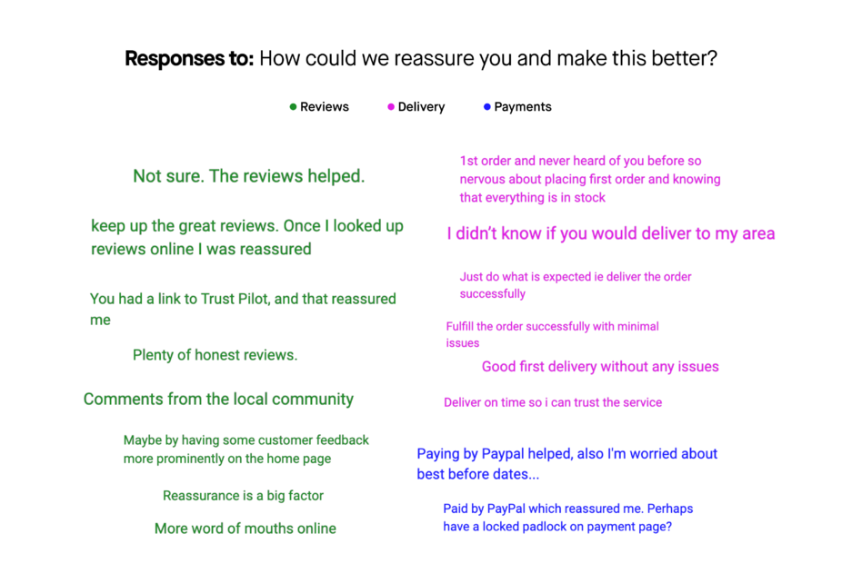
From the survey results (and by studying heatmaps on Hotjar to see where new users had gone to across the site), we could identity that the key themes to look at whilst solving for trust revolve around:
-
Knowing that Bother is real, and are a genuine company.
Note: There are already lots of great reviews on Trustpilot from our customers that prospect users are going to and reading. -
Feeling that transacting with this new e-commerce store would be secure.
Note: Customers were reassured once discovering we supported Paypal later in the customer journey. -
Trusting that their order will be delivered in a manner that meets expectations.
Note: Lots of customers were going to the footer to learn more about the delivery information. (The detail in the page it linked to here also made the service feel very real for customers). The PMF reports also exposed that this was a part of the service that our customers loved most once they had used our service a few times.
High-Level Solution
Being mostly the first touchpoint for new customers, it was clear that the opportunity sat in designing improvements to the website’s homepage to ensure that new customers get a strong sense of Bother’s brand, can easily access information about delivery, and can see that we are already trusted by the hundreds of thousands of families who have already shopped with Bother.
Fictional Happy Customer Quote
“I stumbled on the Bother website by accident after clicking on an ad and the concept looked really interesting. Normally I’m a bit wary of things looking too good to be true but I could immediately see what other shoppers were saying so I decided to give it a go and was excited to make my first order.”
This became a northstar for the optimally designed outcome.
Research: Competitor Analysis
Upon delving into similar companies operating in the E-Commerce household grocery and meal box spaces, I noted that a lot of them highlighted their Trustpilot section to really signal the social proof that lies in reviews from existing customers. They also usually featured a headline that called out the number of orders they were making.
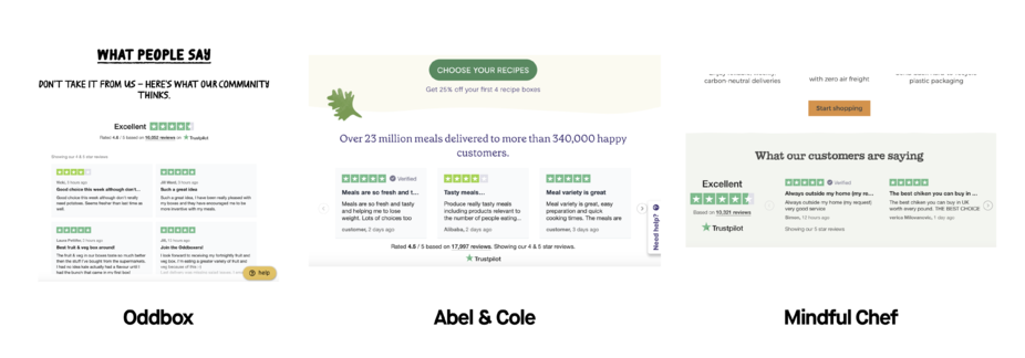
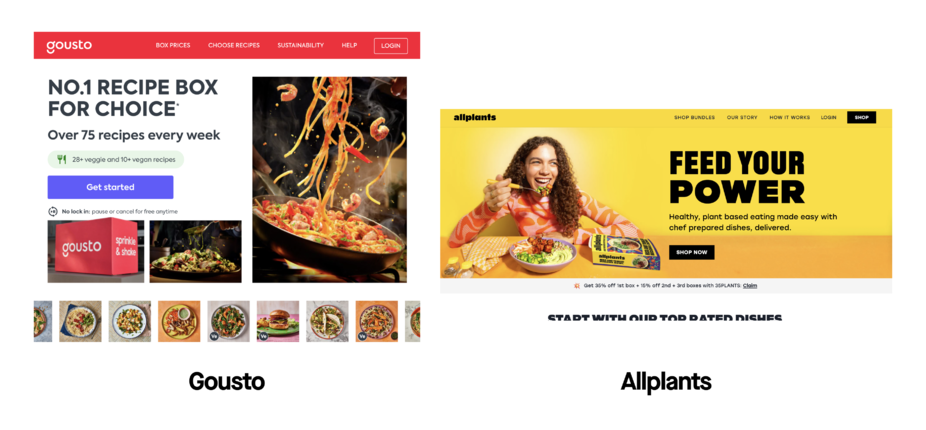
There was also a use of lifestyle imagery in the hero banner. The noted feeling was that this kind of imagery made the product/service feel real - as well as creating an additional benefit of subtly tapping into the endowment effect of feeling as though you already have the product as you could imagine it in your home.
It was clear that both of these techniques were necessary to reduce the concerns around feeling as though this company was legit for new customers, and that their expectations would be met.
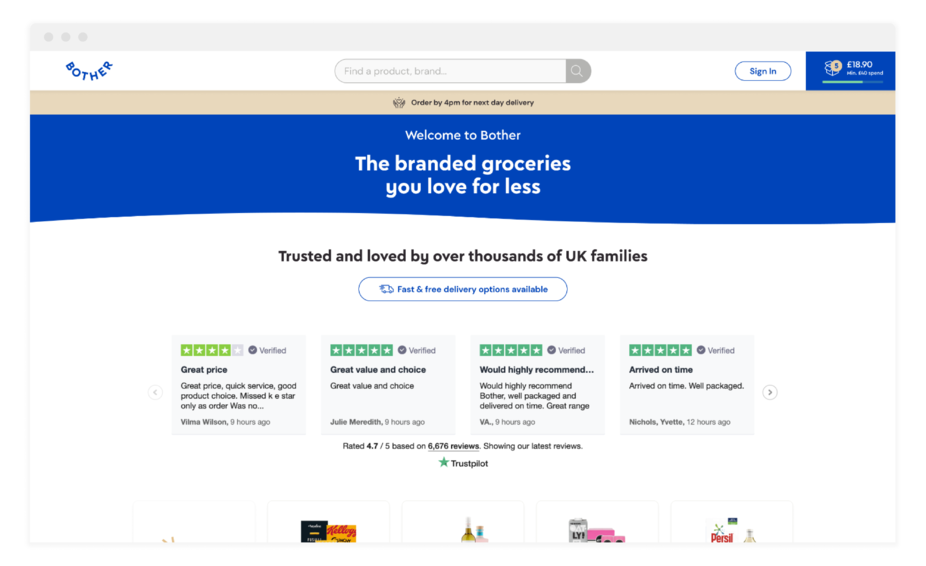
Research: Current Experience Audit
Following this, I delved into the current Bother experience to see if there was anything that was any obvious opportunities or anything present that was being under-utilised.
The current homepage, when looked at exclusively above the fold, placed a lot of emphasis on the search bar and search suggestions (which were not being used all that much according to Hotjar heatmaps). I saw that the top nav bar presented space for the search bar to go into, and would be a fairly familiar/expected design pattern for e-commerce customers anyway.
It was also clear that the top section was missing vitality. Something strongly branded that pulled the customer in, as created trust in the process. Strong, branded imagery was going to be crucial here.
I noticed that the payments section and delivery information sat right at the bottom of the page in the footer - despite both speaking to the suggestions customers had for building trust.
We also had this in the site’s press page, and not featured on the Homepage. The social proof and authority bias leveraging opportunity was clearly lying in showcasing these familiar, prestigious logos in the Homepage.
Exploration and Iteration
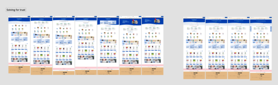
Example variant 1
- Placed new Trustpilot section above the fold with a headline that spoke to the customers Bother are already servicing
- A button for quickly linking users to delivery information whilst also highlighting that fast and free delivery options are available.
Example variant 2
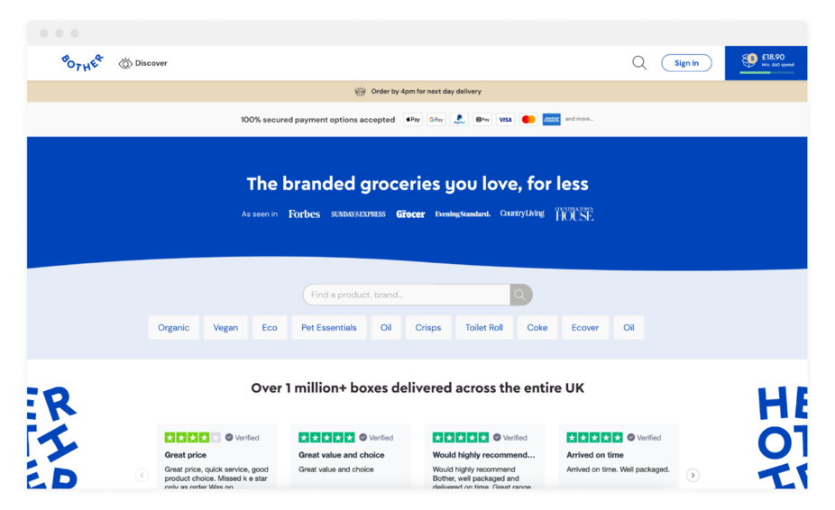
- Featured branded elements that sat with the Trustpilot section.
- ‘As seen in’ press logos in the header that rotated with the Trustpilot rating bar that was already featured in the live header.
Example variant 3
- Imagery in the hero to showcase brands users are already familiar with (to associate Bother with those brands)
- Adding secured payment above the fold.
These were tested and iterated on internally until we arrived at a design that combined those ideas listed in the variants above.
(Final design revealed below)
Usability Preference Test
We also ran a UsabilityHub Preference Test between the Home that was live as a control against the new proposed Home.
This resulted in 80% preferring the new Home design, with some even commenting that the familiar brands and press references helped to add credibility (and revealed there was no risk with moving the placement of the search bar).
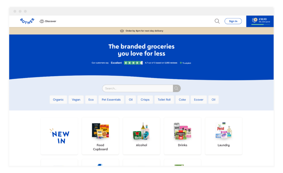
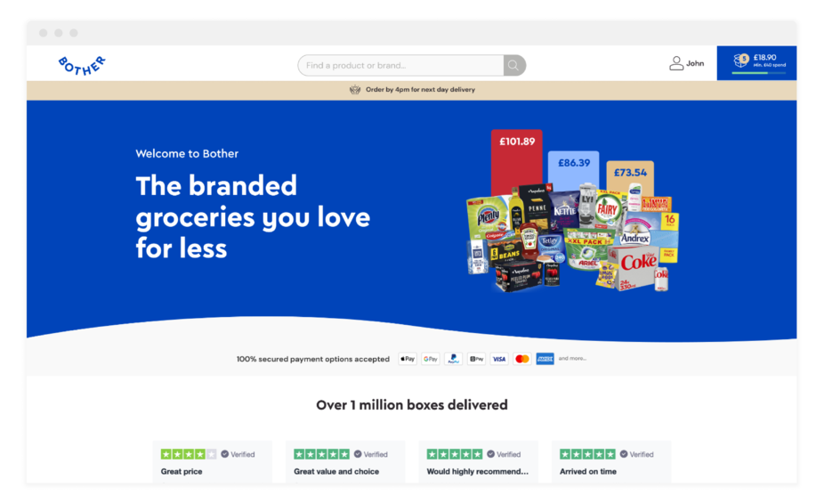
Final Solution: The New Bother Homepage
Alongside Senior Product Manger, Lorin Minxhozi, I presented the final design that was going into sprint in a company-wide demo:
The final redesign used a few elements in order to reduce concerns about trust and fears about expectations not being met upon ordering.
1. Strong lifestyle imagery to make Bother feel real and social proof in press logos
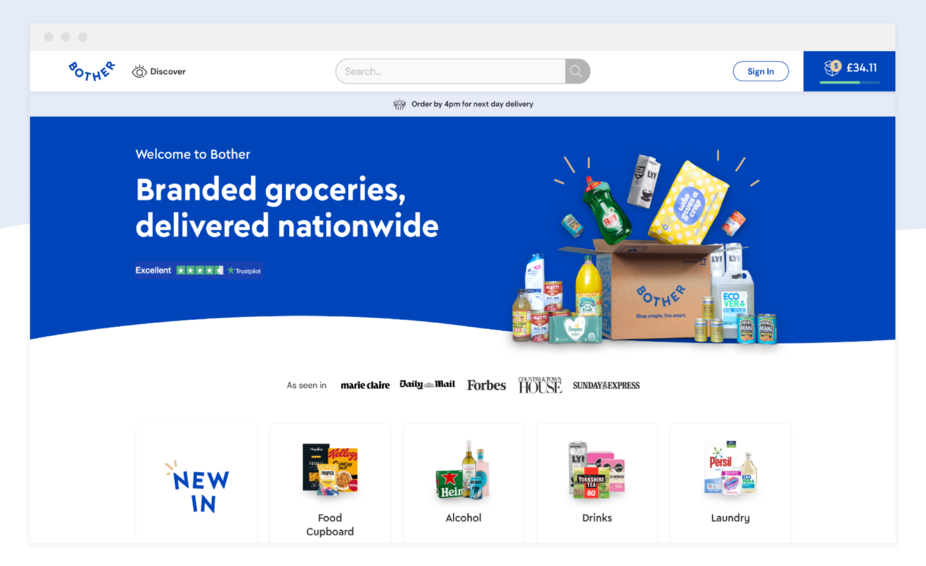
Once we realised that people need to feel that this is real, a strong lifestyle image was added to the hero to hint to something tangible that sits outside of the web experience. A customer would seeing a physical box, with physical products of familiar brands right away - reassuring them whilst subtly leveraging the endowment effect as prospect customers can picture the box arriving in their home.
The headline was also changed to ‘Branded groceries, delivered nationwide’ to support the familiarity bias and to allude to the broad reach of the service.
We then featured the ‘As seen in’ banner with press logos to leverage authority bias and highlight that Bother may be something a customer has simply missed, as apposed to being universally unknown. This all appears even before showcasing products.
2. Secured payment options, Trustpilot reviews highlighted, branded elements, and a delivery information button
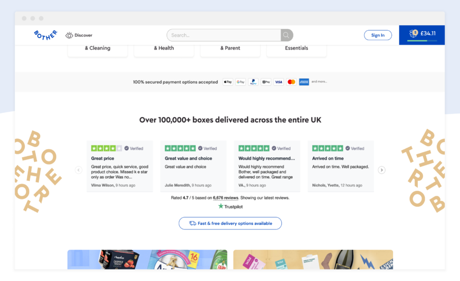
Highlighting secured payment options was also important, so I designed it to be associated to product exploration.
The Trustpilot widget was brought further up, with tagline ‘Over 100,000+ boxes delivered across the entire UK’ for social proof.
The branded element either side of the Trustpilot section was added to leverage effort perception bias to mitigate feeling that this company is a scam/isn’t real as it signals that there is a hard-working team behind it.
Trust was also revealed to be tied to the reassurance that the delivery will meet expectations, and so a button for easily discovering the delivery information details was added to the section.
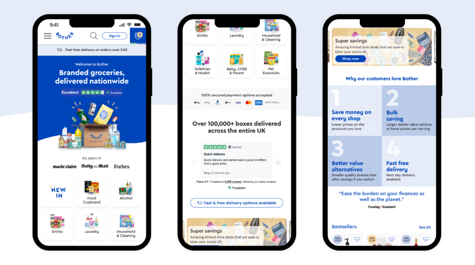
Here is how the site looked on mobile web:
Ultimately, once pushed out live, the final outcome was that we saw a ~90% reduction in trust being mentioned in the Hotjar survey.
Special thanks to
Lorin Minxhozi - Senior Product Manager
Nick Baldwin - Lead (Graphic) Designer
Belen Tahir - Senior Product Designer
***
Definitions of Behavioural Insights used
Authority Bias: Users attribute more importance to the opinion of an authority figure.
Doubt elimination: A process of calling out and/or addressing concerns a user may have before they arrive to them independently.
Endowment Effect: Users value something more if they feel it’s theirs.
Familiarity Bias: The preference to stay within our comfort zone and overvalue the choice that we already know.
Social Proof: People follow and copy the actions of others in order to display accepted or correct behaviour, based on the idea of normative social influence.
***